Route Your Travel - Community & AI
2024From AI-generated travel stories to a connected community of explorers.
A ChatGPT App for Neartail, designed sole-handed under OpenAI's UX & UI principles, so users can create, edit, and publish a food order form without ever leaving the conversation.
In-chat widget & flow
Design completed in 1 month
Founder, co-founder, 1 developer
Your menu changes every Monday. By Wednesday you need a fresh order form on WhatsApp. You don't want a Shopify rebuild. You don't want a Google Form that can't do totals. You want to type “make me an order form for this week's menu” and have a working, branded, payment-ready form in front of you.
That's Neartail's whole pitch. Now ask: how do you put that experience inside a chat window with no modals, no fixed sidebar, and a 380px-wide canvas?
Every web pattern Neartail's main product relies on left sidebar, full-page editor, modal previews, sticky publish bar doesn't exist on this surface. A standalone product has a whole interface to work with. A ChatGPT App has a message bubble.
Create here. Edit here. Publish here. Nowhere else. If a user has to click out to the Neartail web app to fix a typo, the whole reason for being on ChatGPT collapses. Every UX decision in this project is downstream of that one rule.
Discovery on this project wasn't user interviews it was reading OpenAI's Apps SDK documentation end-to-end, multiple passes, translating each line into a concrete design rule. Plus a competitor scan of live ChatGPT Apps and brainstorming with the Neartail team.
OpenAI's published UX principles aren't loose suggestions they're a coherent philosophy: your app is a guest inside ChatGPT, not a destination. Three principles did the heavy lifting.
Apps should embed the entire create-edit-share loop inside the conversation. Don't bounce users to an external product to finish the job.
What it forced. Edit and Publish had to live inside the widget. The first two designs I sketched both included an "Open in Neartail" link both got cut. The final widget keeps every action in-chat: tap an item to edit, tap Publish to ship, get the shareable link as the next message in the conversation. The user never opens a tab.
When the app has something visual to deliver, render the actual UI inline. The widget is the answer, not a preview of one.
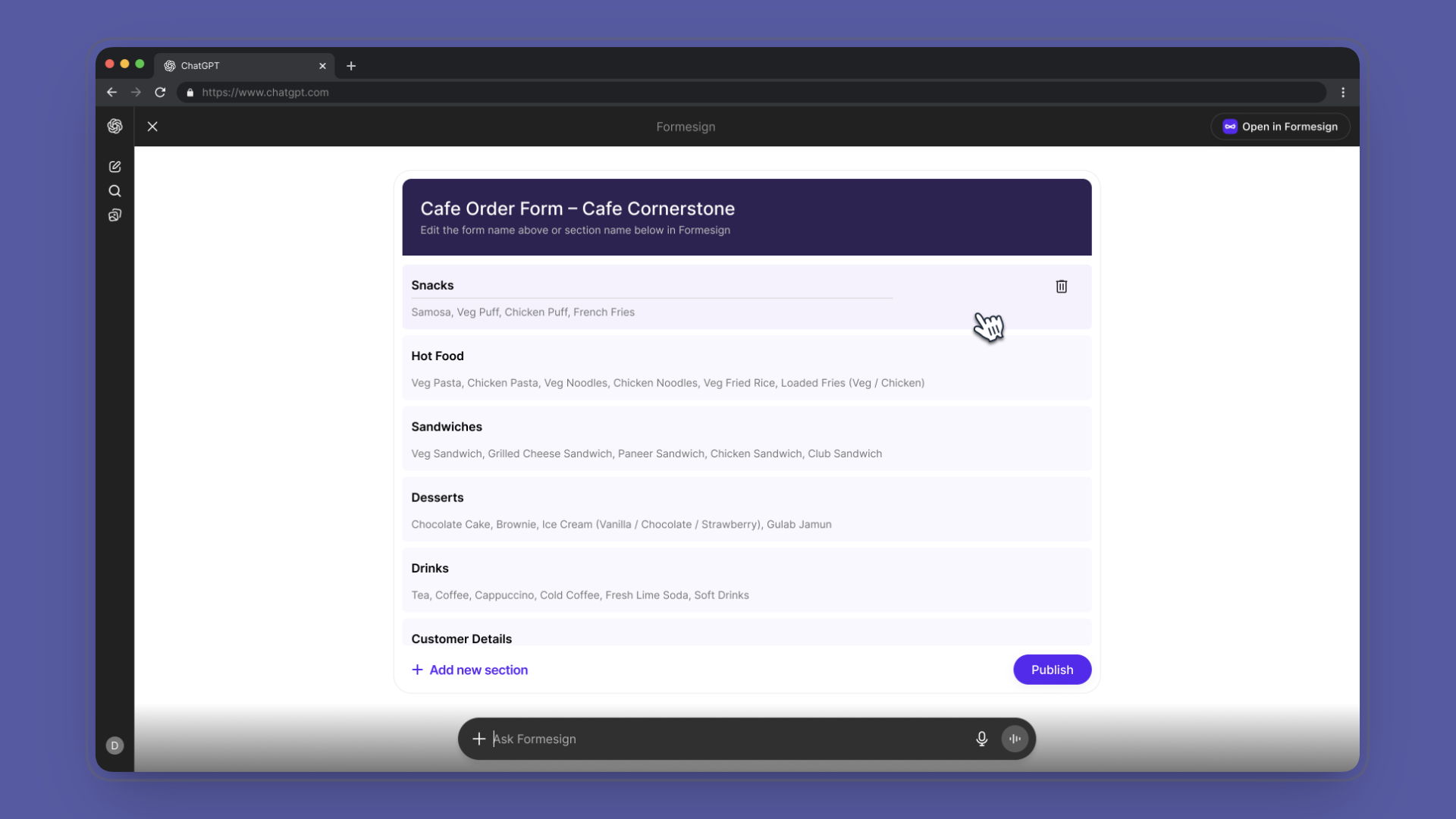
What it forced. The widget had to look like a real form, not a summary card with a button to view a real form. I designed it with the visual signatures users associate with editable forms labelled rows, prices on the right, a clear primary action so a user reading the chat sees "this is a form" before reading a single word of response text. Form-feel was the core design call. The team aligned on it the moment we saw the first mock.
Work within ChatGPT's narrow width, no-modal, no-persistent-state constraints. Don't import your product's full UI for the surface you're in.
What it forced. Typography and spacing scaled down without becoming cramped. I matched ChatGPT's information density a font hierarchy that reads at chat-bubble width, padding tuned for mobile-first viewports, no floating panels. Neartail's brand stays present (mint accents, the form-row pattern) but the chrome is ChatGPT-native. The widget doesn't shout "I'm a different app." It whispers "I belong here."
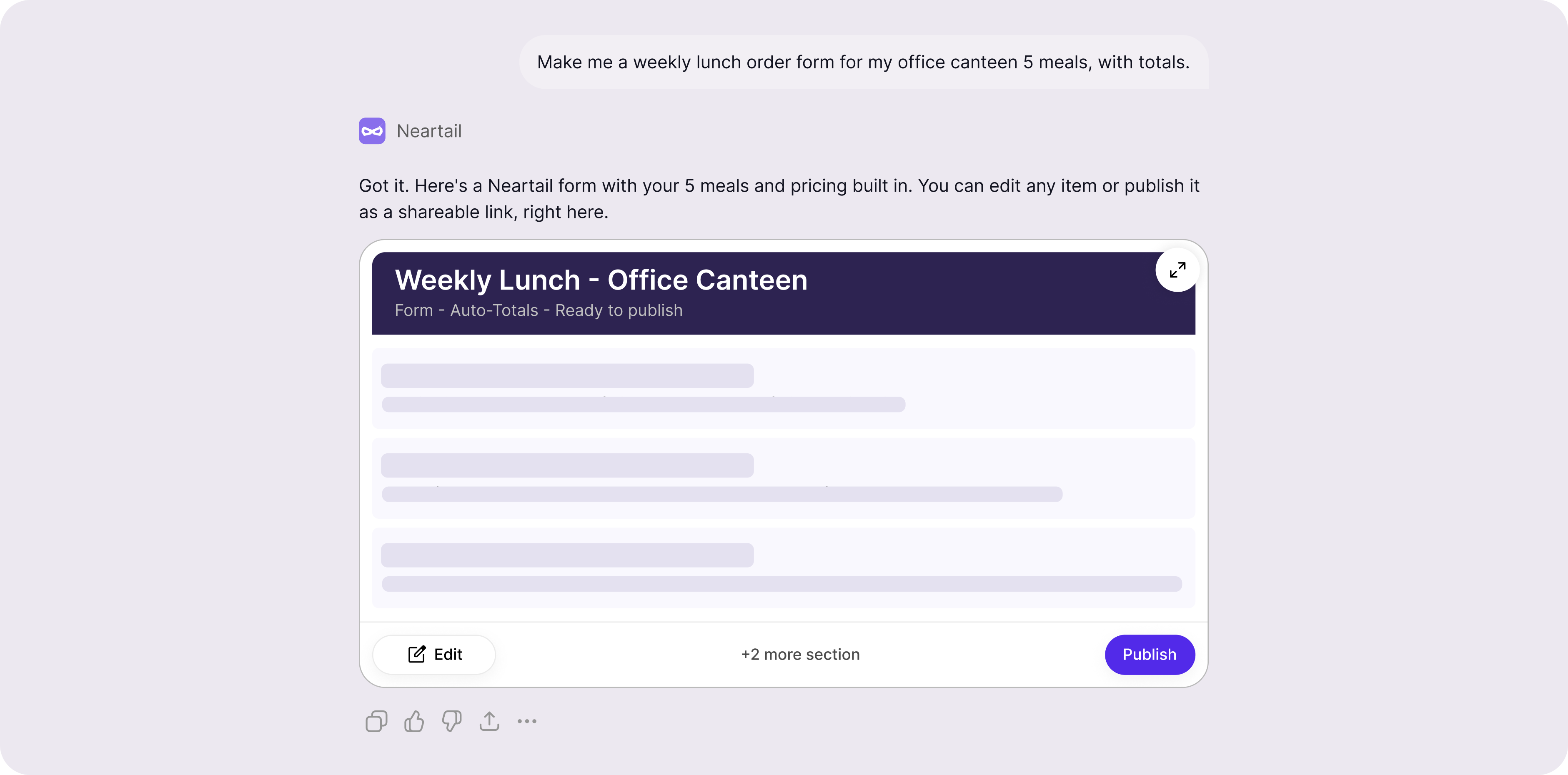
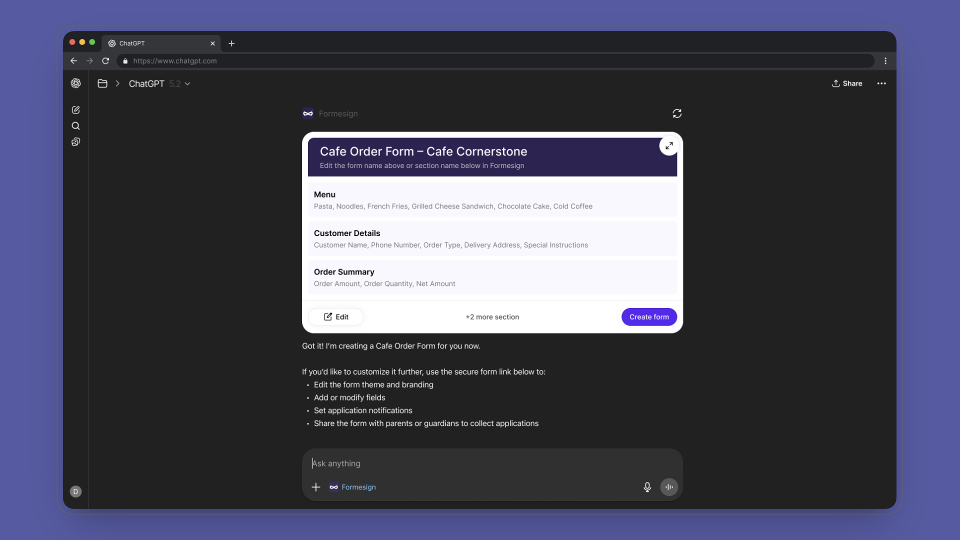
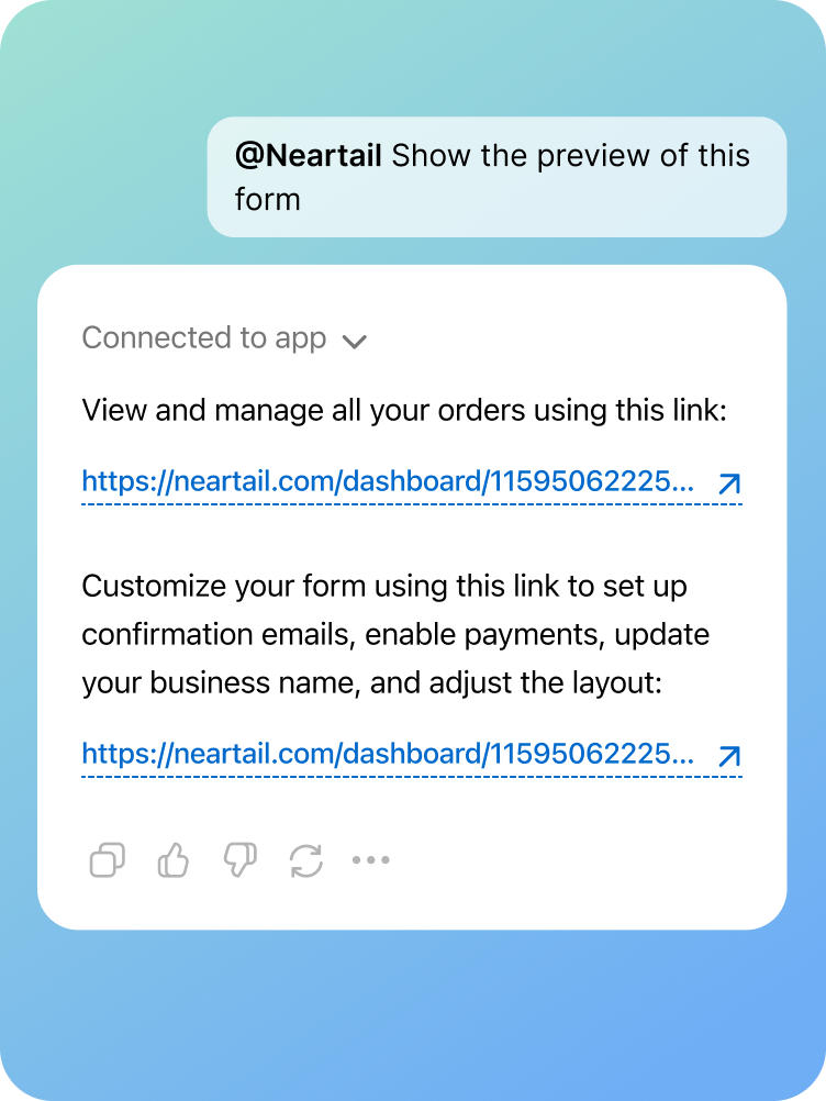
The single most important UI decision was making the widget look like a form not a summary card, not a preview, not a chat-styled message. A user scanning the conversation should see the widget and think "I can edit this," before they've read a word.
What that meant in practice:
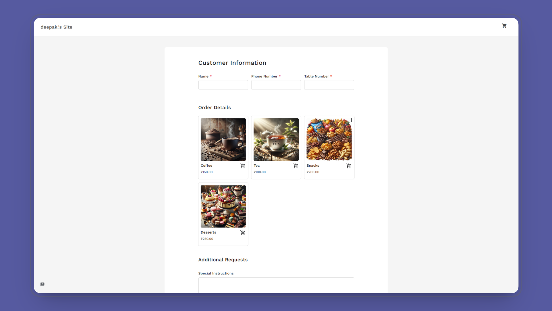
The hero illustration at the top of this case study is a styled approximation of the widget. The real shipped UI lives inside ChatGPT and it's the screenshot above.
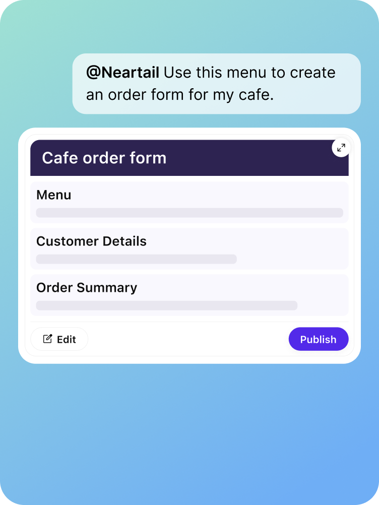
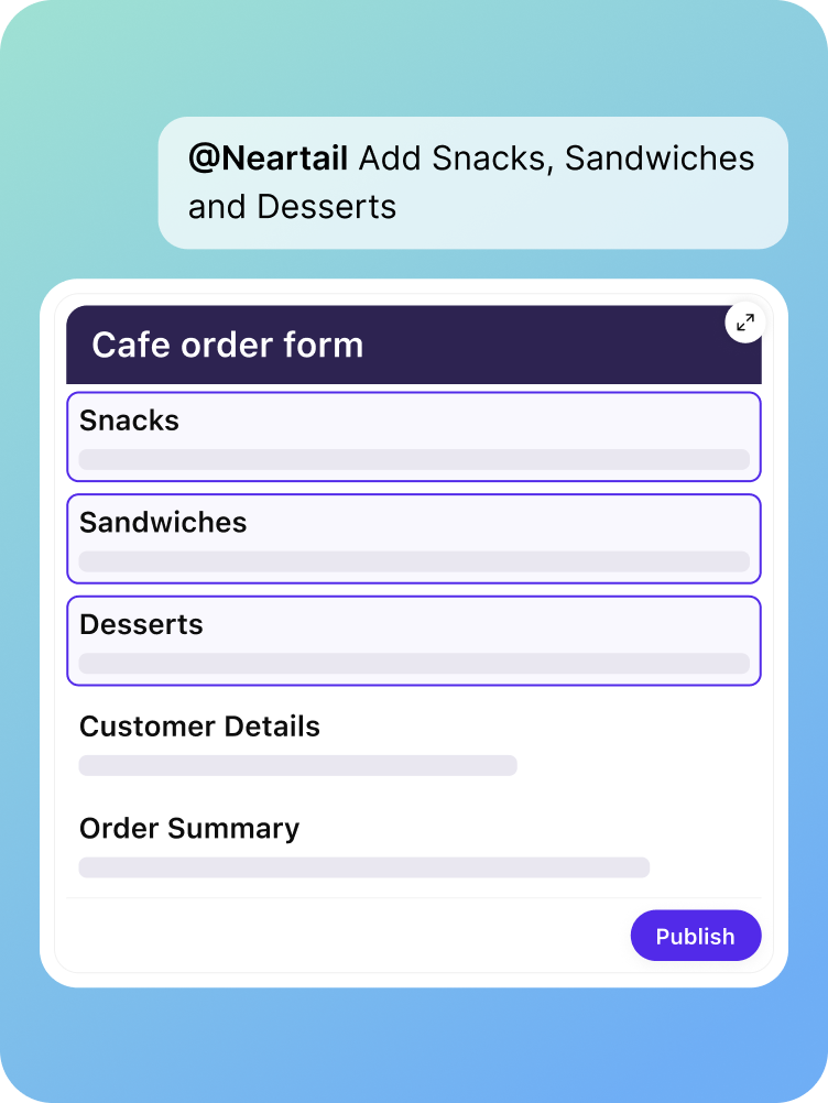
The whole product collapses into three in-chat states. The job was to make each one feel like a natural next message not a screen change, not a modal, not a redirect. Just the chat moving forward.

User describes the menu in plain English. Neartail returns the form rendered as the widget items, prices, totals, all inferred. No setup, no fields to fill, no template to pick.

Tap Edit. Rows become editable in place change a price, rename an item, add or remove dishes. No new screen. No web app. The widget just opens up.
Tap Publish & Share. The widget locks, and the next chat message contains the live, shareable form link ready for WhatsApp, Slack, or wherever the customer lives.
Beyond the in-chat widget, I designed the full set of feature explainer images for the ChatGPT App listing and onboarding. The brief was to communicate Neartail's value in three or four scrollable visuals, before a user even tries the app.
The Neartail team, founder, co-founder, and the lead developer wrote the content briefs. My job was to translate those briefs into visuals that read in two seconds, work at small sizes inside the App listing, and feel consistent with the in-chat widget's design language.
The honest version: the app launched on Apr 23, 2026. Public usage metrics aren't mine to share, and I don't have data from OpenAI reviewers or early users at the time of writing. So the impact section sticks to what's verifiable.

Live on ChatGPT Apps as of Apr 23, 2026 passed OpenAI's review process on resubmission. Visible in the ChatGPT Apps panel for any user with the app enabled.

Core OpenAI principles applied end-to-end across the design conversational, render-first, surface-respect with a fourth (progressive disclosure) running underneath.

States, one conversation, Create → Edit → Publish, all inside the chat. The shipped flow keeps the user inside ChatGPT for the whole loop.

Feature explainer image set shipped with the listing designed by me from content briefs by the Neartail team, used in the App's listing and onboarding.
The Neartail team was super happy with the design the form-feel widget and the in-chat flow matched what we wanted users to experience inside ChatGPT.
A ChatGPT App isn't a smaller web app. It's a different design problem with different rules. Stop importing patterns. Start designing for the surface.
The widget had to read as a form a user could edit before it read as a Neartail product. Visual signatures of editability matter more than logo placement when you're a guest in someone else's UI.
Without public usage data, the case study could feel thin. But passing OpenAI's review and going live on ChatGPT Apps is itself a validation the design met a third party's published bar, not just an internal one.